
Decoding the City Pulse: Multi-Level Visual Exploration of LBSN Data for Urban Planning
Visual exploration of Location-Based Social Networks data in urban planning
The paper introduces a visual exploration tool designed to help urban planners analyze Location-Based Social Networks (LBSN) data, such as Twitter and Flickr. The core method utilizes a coordinated multi-level radial layout for temporal analysis combined with choropleth maps for spatial distribution, enabling planners to uncover urban activity patterns.
TL;DR
Modern cities generate massive amounts of digital footprints via Location-Based Social Networks (LBSN). This paper presents a visual analytics tool that allows urban planners to navigate this "digital exhaust." By combining a unique radial temporal view with interactive spatial maps, planners can finally correlate social media surges with specific land-use categories like residential or industrial zones.
Context: Why Social Media Matters for Urban Design
Urban planners have historically been limited to census data and traffic surveys—snapshots in time that are often outdated and static. In contrast, LBSN data (Twitter, Foursquare) offers a real-time, high-resolution view of how people actually use the city. However, the sheer volume and multi-scale nature of this data (varying from minutes to months, and blocks to whole regions) create a "noise" problem. The authors' insight is that to make this data useful, we must visualize it through the lens of existing urban frameworks: Land-Use Districts.
Methodology: The "Clock and Map" Synergy
The tool’s power lies in its two coordinated views that follow Shneiderman's mantra: Overview first, zoom and filter, then details-on-demand.
1. The Temporal View (The Radial Clock)
Instead of a standard linear timeline, the authors use a radial layout. Why? Human activity is inherently periodic (diurnal and weekly cycles).
- Inner Rings (Daily/Hourly): Visualized like an analog clock, making it intuitive to distinguish between day (top half) and night (bottom half) activity.
- Outer Rings (Yearly/Monthly): Provides a cumulative histogram of activity across months, allowing users to pick specific peaks (like a festival or a weekend) and see how they ripple down to hourly data.
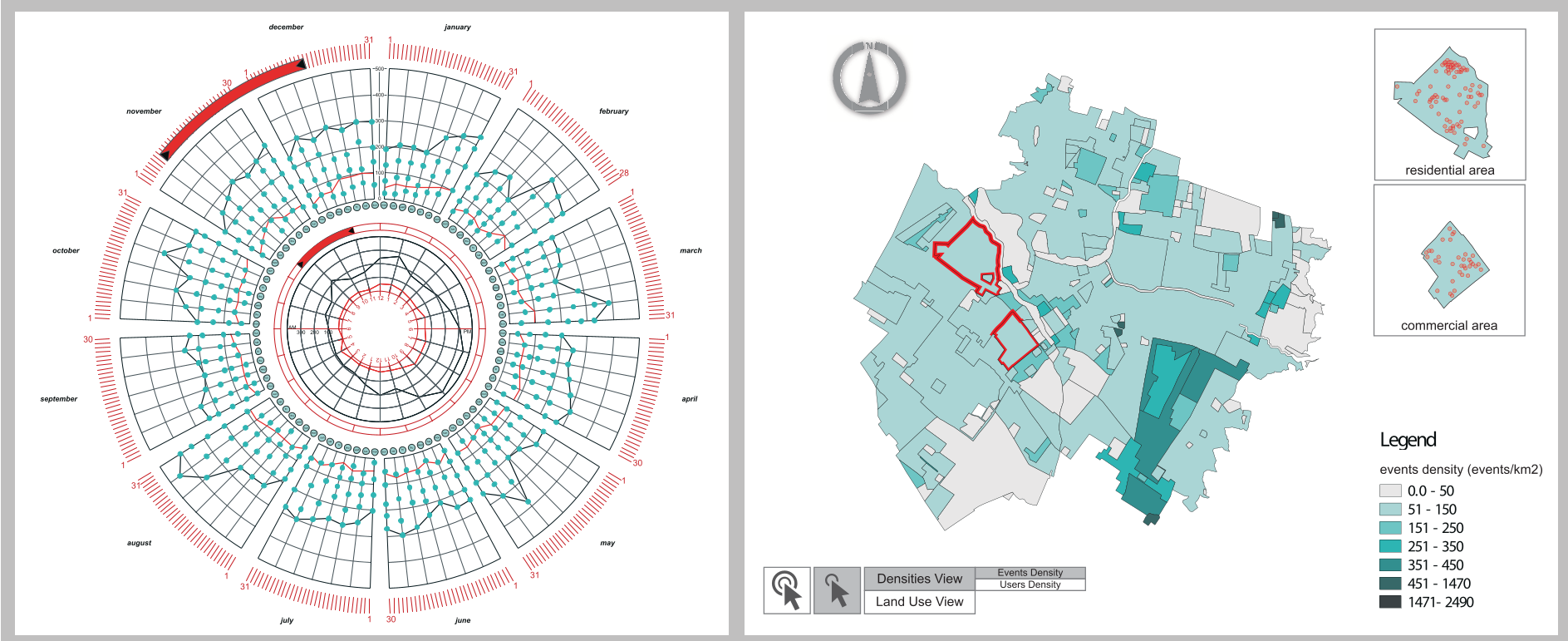 Figure 1: The dual-view dashboard. The left radial rings handle temporal scales, while the right map handles spatial density.
2. The Spatial View (The Contextual Map)
The spatial view uses Choropleth maps, a standard in the urban planning domain, which reduces the "learning tax" for experts.
- Planners can toggle between Event Density (where the noise is) and User Density (where the unique visitors are).
- Brushing and Linking: Selecting a specific district (e.g., a "Mixed Use" zone) immediately updates the radial clock to show only the activity patterns for that specific area.
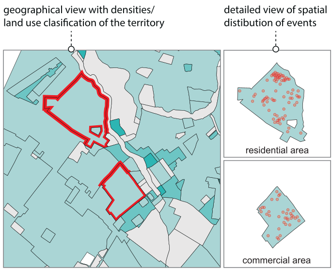 Figure 2: Visualizing event clusters within specific land-use polygons.
Insights from the Territory
The authors tested their design against real-world scenarios. Two key "Aha!" moments emerged:
- Infrastructure Gaps: Areas with zero social media activity despite being high-traffic zones may point to Wi-Fi "dead zones" or security issues.
- Commercial Potential: Regions showing high activity from a high diversity of unique users (not just the same people posting repeatedly) are prime candidates for new commercial developments.
Critical Analysis & Future Horizon
While the radial design is excellent for periodic patterns, it can become cluttered with very high-frequency data. The authors acknowledge this and suggest that the next step is Natural Language Processing (NLP).
The Takeaway: The future of urban planning isn't just about where buildings are; it's about the "digital layer" of human interaction above them. This tool provides the telescope needed to observe that layer without being blinded by the light of a million data points.
Potential Limitations
- Data Bias: LBSN users are not a representative sample of all city dwellers (often skewing younger and more tech-savvy).
- Privacy: As the tool moves from "overview" to "details-on-demand," the risk of re-identifying individuals increases—a challenge for future iterations.
Summary
By bridging the gap between visual query systems and exploratory visualization, this research transforms messy social media pings into actionable urban intelligence. It’s a significant step toward "Smart City" management that is grounded in actual human behavior.