
Visual Perception of Deaf Children: Designing Beyond the Disability Framework
Visual Perception of Deaf Children to Inform Interaction of Tools for Literacy
This paper introduces an online testing environment specifically designed to evaluate the visual perception (color, shape, size) and subjective preferences of Deaf children. Developed using User-Centered Design (UCD) principles, the system integrates Sign Language (SL) video instructions to inform the design of future literacy and educational tools.
TL;DR
This research challenges the clinical "disability" view of Deafness by proposing an online testing suite designed through the lens of Deaf Culture. By using Sign Language (SL) video instructions and "ludic" (playful) interactions, the study identifies how specific visual variables—color, shape, and size—affect information processing in Deaf children, providing a blueprint for more effective educational software design.
Motivation: The Gap in Visual Literacy
90% of Deaf children are born to non-Deaf parents, often delaying natural language acquisition until they enter school. Because Sign Language is inherently spatial and visual, the Deaf community develops unique cognitive strategies for interpreting the world. However, most Educational Technology (EdTech) is designed by hearing researchers using clinical protocols that can be traumatizing or culturally irrelevant.
The authors argue that Human-Computer Interaction (HCI) must move toward "culturally responsive design," acknowledging that for Deaf users, mental images have a deeper influence on focal attention than the scene itself.
Methodology: A Ludic Testing Environment
The researchers built an accessible HTML-based platform (pvtestes.c3sl.ufpr.br) featuring four specific games designed to extract design requirements:
- Memory Game: Tests which variable (color, shape, or size) is noticed "first" (preeminent variable).
- Seven Errors: Evaluates if color helps or hinders the identification of details in complex scenes.
- Connect the Dots: Uses Gestalt similarity to see which variable best helps children group visual features.
- Subjective Preference: Identifies color patterns that could increase user engagement.
Key UX Requirements for Deaf Users:
- Native Language First: All instructions via Sign Language videos.
- Fluent Interpretation: Use of professional interpreters who employ a playful/encouraging tone.
- Visual Focus: Design layouts that keep the user's attention on the main task area to prevent cognitive "splitting."
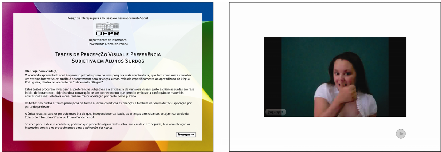 Fig 1: Initial interface for the teacher-evaluator featuring video instructions in Sign Language.
Experimental Insights & SOTA Contrast
The case study, involving 15 Deaf children in a Brazilian public school, yielded counter-intuitive results that challenge standard design assumptions:
1. Attention vs. Complexity
While color and size were the "winners" for capturing immediate attention in the Memory Game, color actually slowed down performance in the Seven Errors game.
- B&W Performance: 6 seconds/error.
- Color Performance: 16 seconds/error.
- Insight: Color can act as "visual noise" when high concentration is required.
2. The Dominance of Shape in Recognition
In the "Connect the Dots" test, the complexity of the shape (e.g., an apple vs. a butterfly) dictated success more than the visual scaffold used. This suggests that existing mental models (objects they already recognize) are more powerful than the visual aids provided by the system.
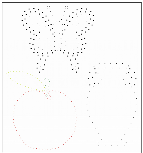 Fig 2: Complexity of the target object (e.g., butterfly vs. apple) significantly impacted the effectiveness of visual scaffolds.
Critical Analysis & Future Outlook
Takeaway for Designers: If you are building tools for Deaf literacy, use size and primary colors (especially Red) for navigation and alerts, but strip away unnecessary color variations when the user needs to focus on detailed semantic content (like reading or identifying specific visual errors).
Limitations: The study notes that while the environment was validated as culturally appropriate, the tests themselves require broader validation across more diverse geographic and linguistic groups. Since Brazil is a vast country, the online nature of this tool is a strategic choice for future remote large-scale validation.
Conclusion: This work represents a vital shift from "testing the child" to "testing the design." By integrating the cultural and linguistic specificities of the Deaf community into the software development lifecycle, we can move toward a more inclusive digital future.