
Visualizing the Future of Fields: Deciphering Precision Agriculture with Self-Organizing Maps
Visualization of Agriculture Data Using Self-Organizing Maps
This paper explores the application of Self-Organizing Maps (SOMs) for the visualization and analysis of multi-dimensional agricultural data. By projecting complex variables like nitrogen levels and soil conductivity onto 2D grids, the authors successfully visualize the impact of different fertilization strategies on crop yield, achieving a clear qualitative understanding of precision farming dynamics.
TL;DR
Agriculture is no longer just about seeds and soil; it’s a data science challenge. This paper demonstrates how Self-Organizing Maps (SOMs) can be used to visualize the "hidden logic" behind crop yields. By transforming complex sensor data and nitrogen application rates into intuitive 2D maps, researchers provide a way to validate precision farming strategies that were previously locked inside "black box" neural network models.
Background: The Big Data Harvest
In the era of Precision Farming (PF), tractors are equipped with GPS, and fields are monitored by electromagnetic sensors. While this generates "heaps of data," the sheer volume makes it nearly impossible for a farmer to see the "why" behind their yield. The authors position this work as a critical step in the Data Mining process: moving from raw data collection to a deep visual understanding of field heterogeneity.
The "Why": Why SOMs?
Most agricultural models focus on prediction (regression). However, the authors argue that visualization is equally vital.
- High-Dimensionality: Soil conductivity, multiple fertilization dates, and vegetation indices create a complex feature space.
- Non-Linearity: The relationship between nitrogen and yield isn't always a straight line.
- Transparency: Farmers need to trust the models. If a Multi-Layer Perceptron (MLP) suggests a specific nitrogen dose, a SOM can visually confirm the correlation between that dose and historical yield trends.
Methodology: Mapping the Invisible
The core of the approach is the Self-Organizing Map (SOM), an unsupervised learning technique that projects high-dimensional data onto a 2D grid while preserving the topological properties of the input.
The Data Stack
The study analyzed two fields in Germany (F131 and F330) with attributes including:
- N1, N2, N3: Nitrogen applied at three different growing stages.
- REIP (Red Edge Inflexion Point): A spectral value indicating chlorophyll content and plant health.
- EM38: Electromagnetic soil conductivity (a proxy for soil moisture/texture).
- Yield 05/06: The target historical and current yield data.
Architecture and Visualization
The SOM uses competitive learning, where neurons compete to represent specific input vectors. The result is a series of "Component Planes"—think of these as heatmaps where each map represents one variable. By comparing the heat patterns between different maps (e.g., Nitrogen vs. Yield), correlations become immediately obvious to the human eye.
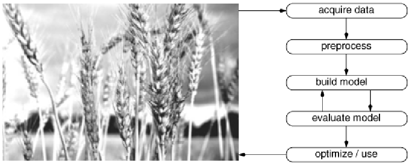 Figure 1: The simplified data mining flow model used in the research.
Experimental Insights: What the Maps Revealed
The experiments yielded several "Aha!" moments that align with both agricultural theory and empirical evidence:
- Strategy Separation: The "U-Matrix" (a visualization of distances between neurons) clearly showed that different fertilization strategies (MLP-optimized vs. Traditional Farmer experience) occupied distinct clusters. The neural network-guided strategy was mathematically different from the status quo.
- The Nitrogen-Yield Insight: In subset analysis (F131-net), the SOM revealed that the MLP had "learned" that areas with high historical yield (Yield 05) required lower initial nitrogen (N1), likely because the soil there was already nutrient-rich.
- Sensor Validation: The REIP49 index (vegetation health) showed a strong visual correlation with final yield, proving that in-season sensors are reliable predictors of harvest outcomes.
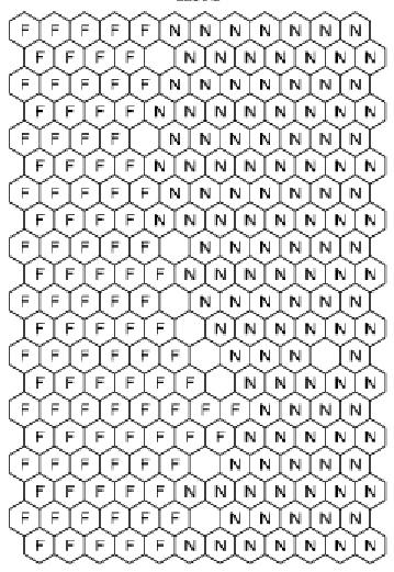 Figure 2: Visual correlation analysis between N1, N2, N3 and the Yield components.
Critical Analysis & Conclusion
Takeaway
The strength of this work lies in its Interpretability. It bridges the gap between sophisticated AI (MLPs) and practical farming. By showing that SOMs can visually confirm a model's logic, it builds the "user trust" necessary for the adoption of precision agriculture.
Limitations & Future Work
The study notes that weather conditions (like the 2006 drought) can significantly disrupt the expected correlations. A model might be perfect, but a lack of rain is a "global" factor the local sensors can't always counteract. The authors suggest that future work should integrate even more granular data, such as low-altitude flight sensors (drones), to refine these "heterogeneity indicators."
In summary, SOMs transform "big data" from an overwhelming heap into a strategic map, allowing farmers to see their fields not just as land, but as a diverse, manageable system of data-driven zones.