
Teacher Report: Bridging the Gap Between Educational Data Mining and Visual Analytics in Moodle
Visualization of educational data mined from the moodle e-learning platform
The paper introduces a custom Moodle plug-in named "Teacher Report" designed for the visualization of Educational Data Mining (EDM) results. It focuses on student evaluation data, leveraging the Highcharts library to provide interactive 2D and 3D visual analytics for instructors to monitor academic performance across multiple years.
TL;DR
Educational Data Mining (EDM) often produces complex datasets that are difficult for educators to interpret in real-time. This paper presents "Teacher Report," a specialized Moodle plug-in that transforms raw grading data into interactive 2D and 3D visualizations. Developed for the University of West Attica, the tool allows instructors to compare individual student performance against class averages and track longitudinal trends across multiple academic years.
Problem & Motivation: The "Data Rich, Insight Poor" E-Learning Challenge
While modern E-learning platforms automatically collect massive volumes of digital footprints, this data is often "trapped" in complex SQL databases.
The authors identify a significant gap:
- Tool Fragmentation: While powerful visualization tools like Gephi or Tableau exist, they are external to the learning environment, requiring tedious data export/import processes.
- Generic Limitations: Existing Moodle tools like the standard Gradebook provide tables of numbers but fail to highlight patterns, such as class drop-out correlations or year-over-year performance shifts.
The motivation was to create a native integration that requires zero programming effort from the teacher while providing high-dimensional insights.
Methodology: Architecture of the "Teacher Report" Plug-in
The plug-in is built as a modular extension of Moodle’s internal logic. It inherits the core security and data access permissions of the standard Gradebook but replaces the UI with a Highcharts-driven visualization engine.
Core Components
- Integration: Uses the
access.phpandindex.phpstructure to remain compatible with Moodle’s plugin architecture. - Visualization Engine: Employs the Highcharts library, chosen for its ability to handle interactive elements (mouse-over tooltips) and its support for both 2D and 3D rendering.
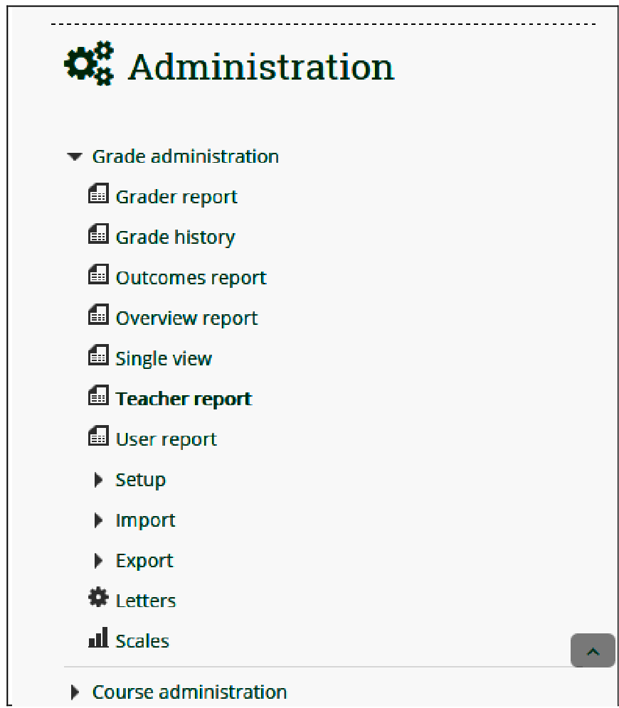 Figure 1: Integration of the 'Teacher Report' into the Moodle Administration Menu.
Experiments & Results: Real-World Deployment
The system was tested on the Digital Signal Processing (DSP) course module at the University of West Attica. Data was analyzed from three consecutive academic years (2015-2018).
Key Visualization Features:
- Individual vs. Class Average: Instructors can see a student's grade (e.g., 5.34/10) directly compared to the class mean (5.27/10) via interactive bars.
- Participation & Drop-out Tracking: A hybrid chart (Bar + Curve) tracks how many students registered versus how many actually completed the final evaluation.
- 3D Grade Distribution: To observe shifts in teaching effectiveness, the plug-in generates a 3D histogram where the Z-axis represents different years, allowing for a "depth" view of grade shifts over time.
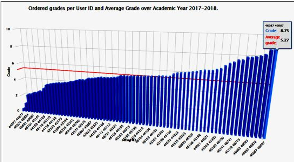 Figure 2: Plot showing all students in a cohort, sorted by grade with a red "Average Line" for quick outlier detection.
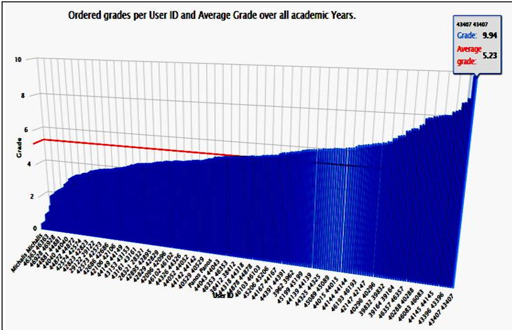 Figure 3: A 3D view comparing integer grade bins (0-10) across three distinct academic years.
Critical Analysis & Conclusion
The "Teacher Report" plug-in effectively moves Moodle from a simple "repository of grades" to a "tool for pedagogical reflection." By allowing teachers to "zoom in" on a struggling student and "zoom out" to see multi-year trends, it provides a dual-scale lens for educational improvement.
Limitations & Future Work
- Data Scope: Currently, the tool focuses primarily on grades. Future iterations aim to include time-stamp analysis (behavioral mining) to see how long students spend on specific activities.
- Predictive Analytics: While the current tool is descriptive (showing what happened), the authors suggest moving toward predictive models using 3D scatter plots to forecast student failure before it occurs.
Takeaway
For institutions using Moodle, the shift toward custom-developed visualization plugins is essential. It ensures that the specific "Inductive Bias" of the local curriculum is reflected in the analytics, providing insights that generic tools simply cannot offer.