
Jasper: Achieving Clarity in the "Hairball" Era of Massive Social Networks
On visualization techniques comparison for large social networks overview: A user experiment
The paper introduces Jasper, a space-filling, pixel-oriented visualization technique designed to provide compact overviews of large social networks ( nodes). It leverages community detection and space-filling curves to represent nodes as individual pixels while preserving structural adjacency, achieving competitive performance in community-based analytical tasks.
TL;DR
Visualizing social networks with millions of nodes usually results in an unreadable "hairball." Jasper (Just A new Space-filling Pixel-oriented layout for large graph ovERview) solves this by treating every node as a single pixel and arranging them along a space-filling curve. This eliminates edge clutter while maintaining the structural "mental map" of communities, allowing researchers to see the entire network structure at a glance without a supercomputer.
The Scalability Crisis in Graph Visualization
As social networks grew from thousands to millions of members, our visualization tools hit a wall. Standard Node-Link Diagrams (NLD) become a tangled mess of overlapping edges, while Adjacency Matrices, though mathematically clean, are often unintuitive for spotting propagation patterns.
The authors argue that for a "first look" or overview, we don't actually need to see every edge. Instead, we need to see communities and how they relate. The core insight is: if we place nodes that are connected near each other in a pixel grid, the spatial proximity itself acts as a proxy for the edges.
Methodology: The Two-Phase Transformation
Jasper transforms a network into a pixel-grid through a clever two-step pipeline:
1. The Coarse Layout (Phase I)
The system first identifies communities using the Louvain algorithm. These communities are treated as "super-nodes" to create a skeleton graph. This skeleton is laid out using a force-directed algorithm (FM3), establishing where each community "lives" in the 2D plane.
2. The Pixel Mapping (Phase II)
To fit thousands of nodes into a compact space without gaps or overlaps, Jasper uses a Morton (Z-order) space-filling curve. By dividing the space recursively (similar to a k-d tree), it assigns every individual node to a specific pixel coordinate that respects its community's position from Phase I.
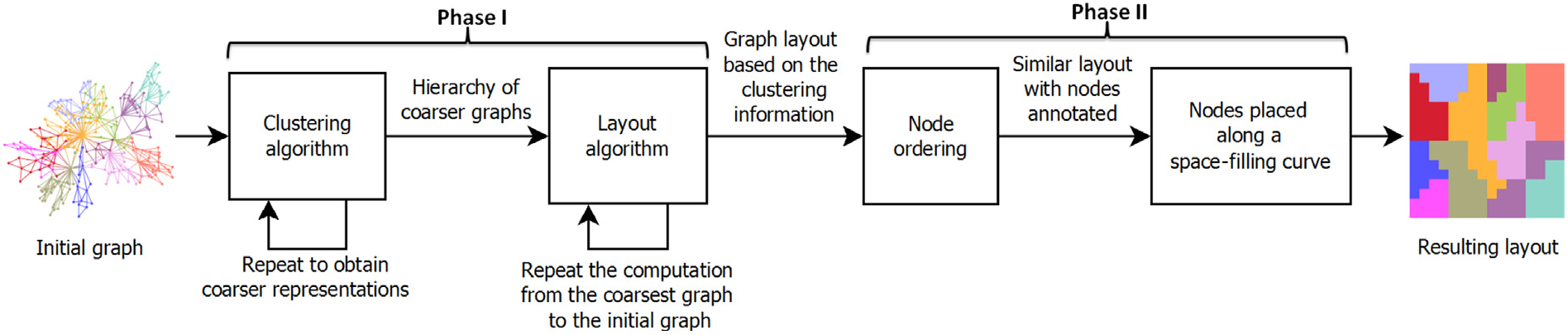 Figure 1: The transition from a cluttered node-link view to a structured, space-filling pixel overview.
Experiments: Measuring the Human Factor
The researchers didn't just build a tool; they tested it against the industry standards: standard Node-Link Diagrams (NLD), NLDs with community separation (NLD-com), and Adjacency Matrices.
Using four real-world datasets (including Enron emails and DBLP co-authorship), participants performed three tasks:
- Size Detection: Identifying the largest community.
- Counting: Discernment of highlighted groups.
- Connectivity: Determining if two groups are linked.
Key Findings
- Jasper vs. Matrix: For identifying community sizes, Jasper performed on par with the Adjacency Matrix, which is historically the "gold standard" for this task.
- Clutter Reduction: Jasper significantly outperformed standard NLDs in task accuracy when networks grew large, as NLDs became too cluttered to read.
- Efficiency: In connectivity tasks, users were 50% faster using Jasper than using Matrices, suggesting that the spatial metaphor of "proximity = connection" is highly intuitive.
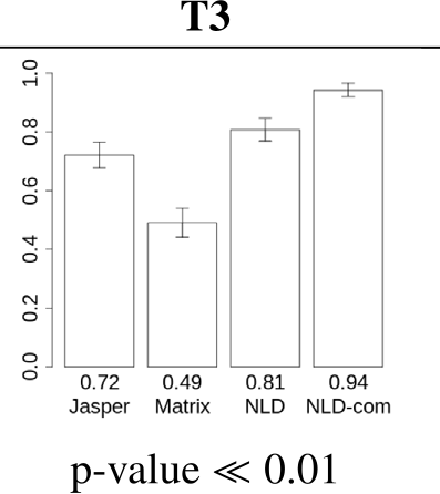 Figure 2: Statistical comparison of response times and error rates across different visual conditions.
Critical Insight: The "Hidden Edge" Trade-off
Jasper's primary limitation is the intentional hiding of edges. While the pixel-proximity metaphor works well for communities, it makes it impossible to trace an individual path between two specific users.
However, as the authors suggest, Jasper is designed for the "Overview First" stage of the Information Seeking Mantra. It isn't meant to replace detailed analysis but to provide the structural context that current "hairball" visualizations destroy. In scenarios like tracking a viral marketing campaign or a disease spread, seeing the "jump" from one pixel-block (community) to another is far more valuable than seeing a million individual lines.
Conclusion
Jasper represents a shift toward Space-Optimal Visualization. By effectively squeezing a million records into a million pixels, it allows analysts to utilize every single pixel on a modern 4K monitor to represent data, rather than wasting space on edge-crossings. It is a robust, "all-encompassing" solution for a quick structural health check of a massive social ecosystem.