
Mapping the Digital Soul: How SOM Visualizes the Life Cycle of Social Networks
Visualizing the evolution of a web-based social network
This paper presents a method for visualizing the evolution of web-based social networks using Self-Organizing Maps (SOM). By applying Kohonen's unsupervised neural networks to the link patterns of the Blogalia community, the authors provide a 2D topographic representation of how blogs migrate through various social structures over time.
TL;DR
Can we see a community grow? This paper leverages Self-Organizing Maps (SOM)—a type of unsupervised neural network—to turn intangible blog links into a physical map. By tracking the link patterns of the Blogalia community over 20 months, the researchers created a "weather map" of social evolution, where blogs migrate from high-altitude "newbie" zones to the deep "founding father" clusters as they gain authority.
The Problem: The Fog of Social Dynamics
In 2007, the "blogosphere" was the frontier of social interaction. However, understanding how a community formed was like trying to map a forest while the trees were still moving. Traditional network analysis gave us the "what" (e.g., this node has 500 links), but it failed to provide the context. Why is this blog popular? Is it part of a political clique or a tech circle? How did it get there?
Existing tools were either too static or too complex. There was a desperate need for a method that could reduce the dimensionality of thousands of links into a simple, human-readable 2D map without losing the "topology"—the fundamental relationships between neighbors.
Methodology: The Kohonen Intuition
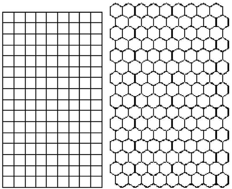
The authors turned to Kohonen’s Self-Organizing Maps (SOM). The intuition is beautiful: just as the human brain maps sensory inputs (visual, auditory) into specific cortical areas, a SOM takes high-dimensional data and forces it to organize itself onto a 2D grid.
The Feature Engineering
Each blog was represented as a vector. If Blog A links to Blog B, that’s a data point. With 162 blogs, each blog is a point in a 162-dimensional space. The researchers sliced the data into five time periods to introduce a temporal dimension.
The Competitive Learning Loop
- Competition: For every link vector, the map finds the "Winning Neuron" (Best Matching Unit) that looks most like it.
- Cooperation: The winner pulls its neighbors on the grid closer to the data point.
- Evolution: Over time, blogs with similar linking habits (e.g., two tech blogs linking to the same sources) naturally "drift" toward the same coordinate on the map.
Visualizing Growth: From Newbie to Authority
The study's most striking result is the Trajectory Analysis.
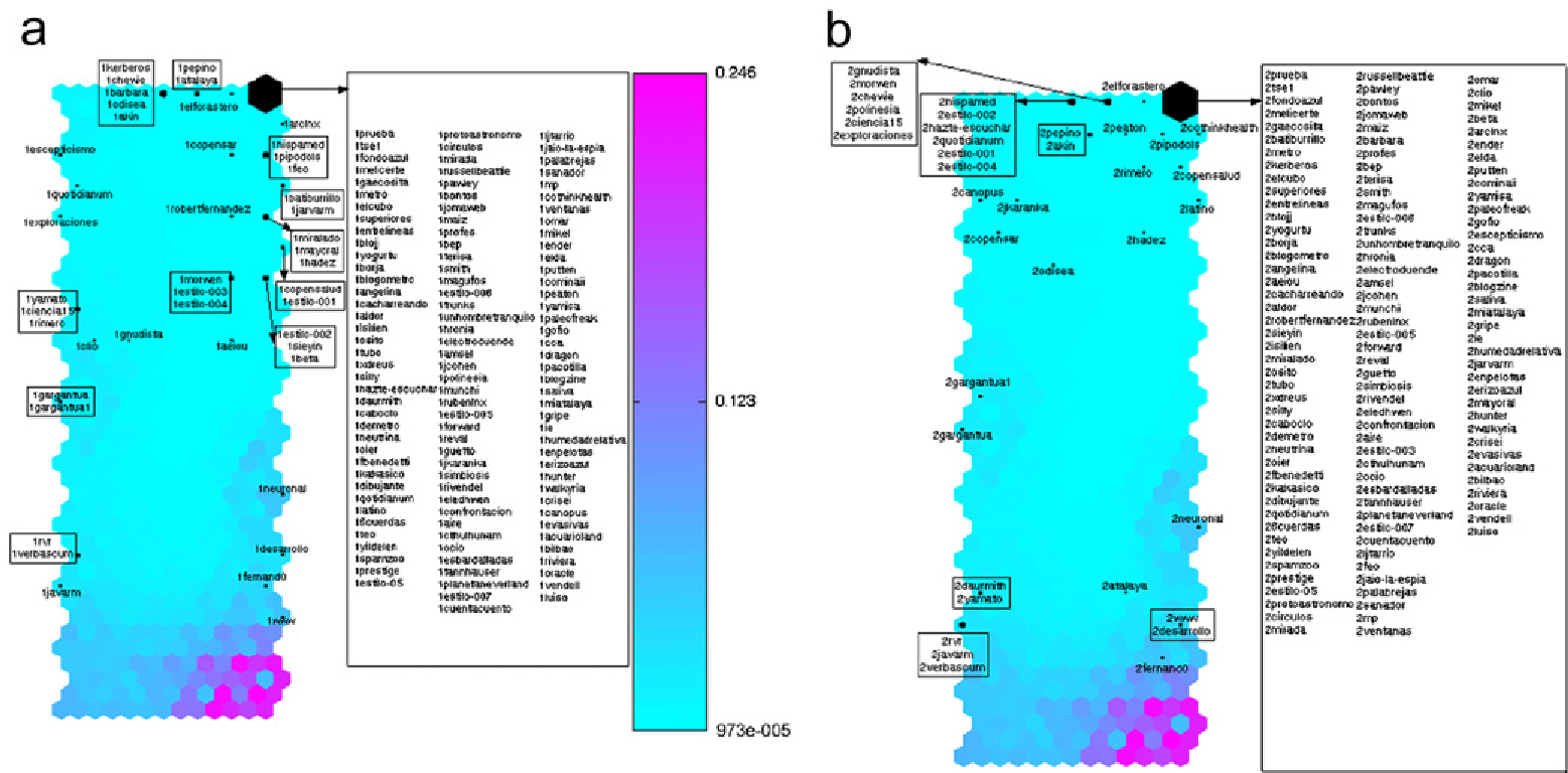
When a blog is first created (Period 1), it usually has zero links. In the SOM, these blogs congregate in the upper right-hand corner—a sort of "digital nursery." As the blog becomes active, it begins to "travel" across the map.
The "Founding Fathers" vs. "Active Newcomers"
By Period 5, the map reveals a clear social stratification:
- The Bottom-Right: Occupied by the "Founding Fathers"—high-authority, older blogs like
fernand0andatalaya. - The Bottom-Left: Home to the "Active Newcomers"—blogs that are newer but have gained massive momentum quickly.
- The Top: The "Inactive/New" zone.
The U-Matrix (Fig 5f) acts as a topographical map where "fences" (high-value areas) separate different thematic clusters. The map didn't just organize by popularity; it separated Technological blogs from Political/Personal blogs naturally, based purely on who they linked to.
Experimental Evidence
The authors used 17,000 links from 11,000 blog posts. The quantitative success was measured by Quantization Error and Topographic Error, both of which remained remarkably low (~0.01). This indicates that the 2D map is an extremely accurate representation of the 162-dimensional reality.
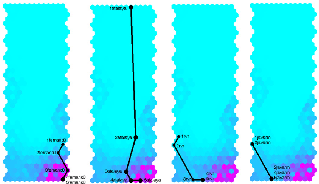 Figure: The "Trip" of top-linked blogs moving from the top of the map (inception) to the bottom (authority).
Critical Analysis & Conclusion
The value of this work lies in its unsupervised nature. The researchers didn't tell the AI which blogs were "tech" or "political"—the network figured it out through the link structure.
Limitations:
- Scale: The study was limited to 162 blogs. In today’s world of millions of social media users, the computational cost of a standard SOM might be prohibitive without pre-clustering.
- Link Depth: The study only looked at internal links within Blogalia, ignoring the wider web.
The Takeaway: This paper proved that social networks have a "territory." By mapping the evolution of these networks, we can diagnose the health of a community, identify influential "hubs" early, and even predict where a new user might end up based on their early interactions. It’s a foundational step toward the "social weather forecasting" tools we see in modern community management today.