
Tailoring Persuasion: How Color and Framing Turn Gender into a UX Power Tool
Tailoring Web Pages for Persuasion on Prevention Topics: Message Framing, Color Priming, and Gender
This study investigates the persuasive effectiveness of Web pages for prevention topics by manipulating message framing, color priming, and recipient gender. It proposes a tailored approach to Web design, demonstrating that the combination of "Gain" or "Loss" framing with specific color cues (Red vs. Grey) significantly impacts attention and perceived response efficacy based on user gender.
TL;DR
Stop designing one-size-fits-all safety campaigns. This research proves that a Web page's effectiveness in fire prevention depends on a "Triple Interaction" between gender, the way a message is framed (Gain vs. Loss), and the background color (Red vs. Grey). The key takeaway: Red isn't just an aesthetic choice—it's a psychological amplifier that makes women more responsive to "Gain" messages and men more responsive to "Loss" messages.
The "One-Size-Fits-All" Fallacy
In the world of UX and Persuasive Technology, we often assume that a clear, urgent message will work for everyone. However, human psychology is rarely that uniform. Existing literature suggests that when it comes to prevention (e.g., installing smoke alarms), women tend to be more influenced by what they gain (safety, peace of mind), whereas men are often more sensitive to what they might loss (death, property damage).
The author, Luca Chittaro, identified a critical gap: How do these linguistic frames interact with peripheral visual cues like color? Does Red always mean "danger," or does it function as a "volume knob" for the message's primary intent?
Methodology: The Fire Safety Experiment
The study used a 2x2x2 experimental design. Participants viewed one of four versions of a fire safety Web page:
- Gain-Framed + Red Prime
- Gain-Framed + Grey Prime
- Loss-Framed + Red Prime
- Loss-Framed + Grey Prime
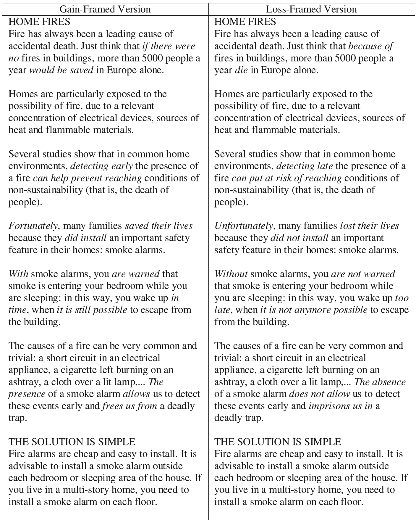
The textual differences were subtle but strategic. For example, the Gain-framed version stated: "5000 people a year would be saved," while the Loss-framed version stated: "5000 people a year die."
Key Insight: Red as a "Human Alarm System"
The most fascinating finding was the role of the color Red. Rather than simply scaring everyone, Red acted as a trigger for the "Human Alarm System." When this system is activated, people process information more alertly.
The Gender Divergence:
- For Women: The Red background made the Gain-framed message significantly more persuasive. It increased their perceived "response efficacy"—their belief that smoke alarms actually work.
- For Men: The Red background specifically enhanced the Loss-framed message, driving higher levels of attention compared to Gain framing.
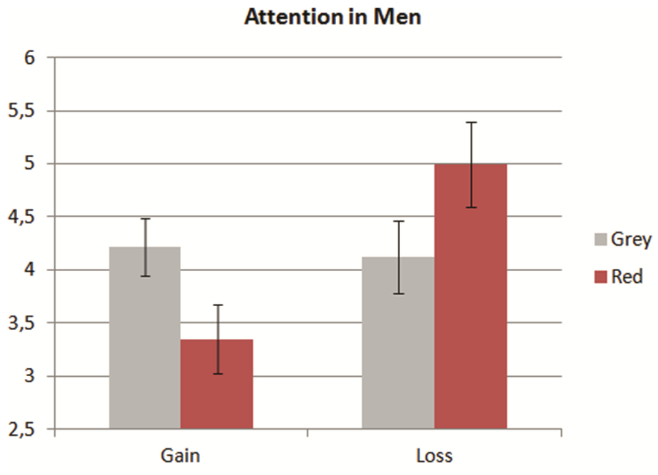 Fig 1: Notice how the red bar (Alertness/Attention) peaks for Men under Loss framing, but peaks for Women under Gain framing.
Results & Experimental Evidence
The data showed a statistically significant triple interaction (p < .01).
- Response Efficacy: Women exposed to the Gain frame with Red reported a massive 6.58/7.0 score on how "useful and important" smoke alarms are.
- Alertness: Men showed the lowest attention levels when shown a Gain frame with Red, suggesting an "incongruency" that might lead to disengagement.
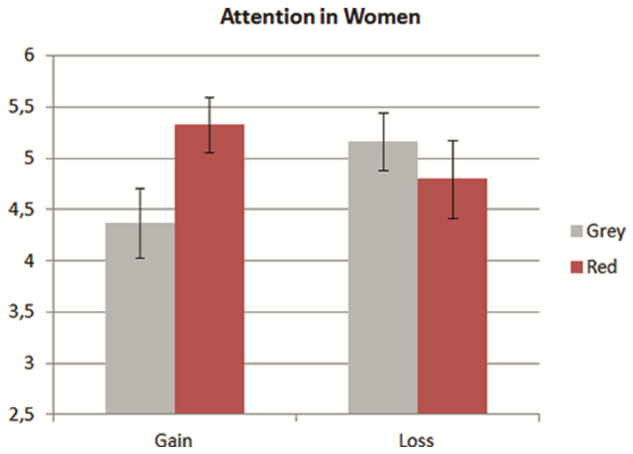 Fig 2: Response efficacy reaches its zenith for women when Gain frames are combined with Red priming.
Critical Analysis & Future Outlook
This work moves beyond simple A/B testing into the realm of Dynamic Tailoring.
The "Why" Behind the Effectiveness
Why does Red enhance Gain for women? The author suggests that in prevention contexts, Red primes "safety" and "vigilance." For women, who are biologically or socially conditioned toward Gain-framed prevention, this vigilance makes them lean harder into the positive solution. For men, the threat cue of Red aligns perfectly with the threat-based "Loss" frame, creating a unified psychological push.
Practical Takeaways for Developers:
- Automated Personalization: If your Web app knows the user's gender (via Social Login or API), you can programmatically swap CSS variables and copy.
- Targeting Logic:
IF User == Female THEN Frame = Gain; AccentColor = #FF0000;IF User == Male THEN Frame = Loss; AccentColor = #FF0000;
- Context Matters: The author warns that these effects are specific to Prevention. In a dating app, Red might prime attraction instead of avoidance.
Limitations
The study focused on a European sample. While Red is often considered a universal "danger" sign, other colors like White or Black vary wildly in meaning (e.g., mourning vs. purity) across cultures. Future research should investigate if these gendered reactions hold true in Asian or African contexts.
Conclusion
This paper serves as a blueprint for the next generation of persuasive Web design. By understanding that "Red" is a megaphone for the primary message frame, designers can stop guessing and start tailoring interventions that save lives more effectively.